By KIM COOK
Associated Press
You might think of storage cabinets as utilitarian. But designers are forever fascinated with how a simple cupboard can be built, dressed and adorned in ways that showcase craftsmanship and inventiveness.
There are sleek, low-slung consoles with jewelry-esque handles. Swanky Deco-style bar cabinets. Rustic credenzas hewn of timber. And some pieces clad in artistic flourishes, or that are even art themselves.
Far from workhorses, these casegoods are dressage ponies, ready for their closeups.
“These new cabinets are detailed in a way that’s not just a rectangular box with straight metal legs. They have interesting details. And people who are designing casegoods these days are thinking about these details, thinking about what the legs and doors look like, etc.” says San Francisco interior designer Jay Jeffers.
He also says “the use of mixed materials is a trend – rattan, ebonized oak and casegoods covered in grasscloth.”
Jeffers has come up with a new cabinet collection for Arteriors. The Cantu oak cabinet, one of his favorites, features fluted brass hardware and an outside edge beveled like an arrow. “I designed it to feel like a piece of art,” he says.
Jeffers is mindful of multifunctionality when designing a cabinet: The Cantu piece, for example, has shelves that can be removed to store clothing. And he loves using it as a bar cabinet for entertaining.
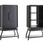
Contemporary Italian furniture maker Poltrona Frau collaborated with Shanghai-based architecture and design firm Neri+Hu on the Mi cabinet series. “Mi” can mean “looking” and “secret” in Chinese, and the pieces play on the term by tucking contents behind an oblong, leather, outer shell, then situating the marble top shelf a few inches above the base, creating a peek-a-boo space.
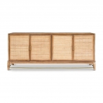
Designer Lindye Galloway of Costa Mesa, California, looks to her Golden State roots for inspiration. Her Bixby hutch features the rounded silhouette of Big Sur’s Bixby Canyon Bridge arch, in natural teak trimmed in black. And her California credenza brings a modern, coastal vibe to a teak-framed, cane-fronted cabinet with brass detailing.
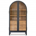
Caning is also a feature of Leanne Ford’s new collection for Crate & Barrel. Her 80-inch-tall, 45-inch-wide Fields cabinet has a white oak lower section and an airy cane upper. Gently rounded corners and a natural blonde finish give the sizeable piece a light footprint. And a drum-shaped bar cabinet showcases the woven material, in natural or charcoal.
Lenny Kravitz, who has branched into product design, has a collaboration with Crate & Barrel as well. Among the statement pieces are the Paseo cabinet, with Cubist motifs and African-inspired detailing, and the Kibo credenza, combining Brutalist and French industrial elements in a chunky oak frame with polished, pleated steel doors.
From architect and product designer Ezra Ardolino’s Timbur studio come two credenzas crafted of stacked, slim layers of Baltic birch. The material has a linear quality similar to a topographic map. The Fresnel model has doors slatted like the big theater light it gets its name from. And the Bubble cabinet showcases the laminated layers as concentric rings. Both credenzas open to reveal a playfully spicy crimson interior.
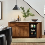
Room and Board has teamed up with the St. Louis-based refrigeration company True Residential to create the Amherst cabinet, a clever white oak or walnut storage piece with a built-in fridge that can work as a resting spot for a TV, books or art objects.
Deny Designs has an extensive collection of Baltic birch credenzas featuring front panels designed by artists; they might be an interesting way to bring art into a room where wall space is in short supply. Available from various retailers.
A misty mountainside forest ascends the front of Studio 83 Oranges’ Forest Fog cabinet, available at Overstock. Photographer Bree Madden’s dreamy images of Southern California landscapes and landmarks is on a collection at Havenly. And at Target, there’s an array of tribal prints, illustrated florals and groovy, graphic motifs on Deny cabinets.
Finally, if you really want to splash out on the cabinet-as-artform idea, there’s Jonathan Adler’s Spring 2022 collection and Boca do Lobo’s avant garde designs, crafted in Portugal.
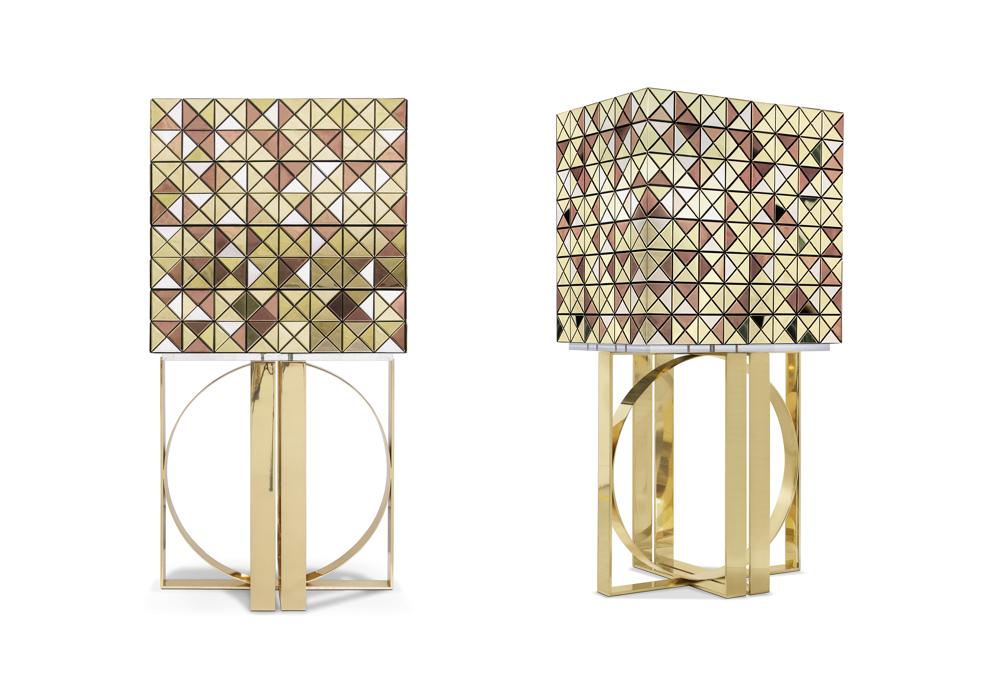
Boca do Lobo’s Pixel bar cabinet exterior is clad in over a thousand multicolored triangles made of woods like palisander and African walnut, evoking a pixelated image. Inside, mirror and diamond-quilted blue silk showcases nine drawers, each with a golden knob.
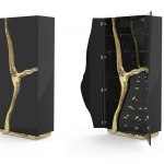
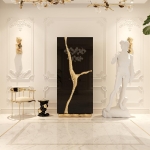
Then there’s the Lapiaz cabinet collection, named for the geologic phenomenon of erosion. Artisans create channels out of molten metal which are integrated into cabinetry faced with walnut, burled poplar, ebony or stainless steel. The pieces can look opulent in certain rooms, but in a minimalist interior they’d be more likely to evoke the Japanese art of kinsugi, in which broken crockery is repaired with liquid metals.
“Every piece in your home is an opportunity for visual drama, for high voltage design,” Adler says.
His spring collection includes the Kiki cabinet, which nods to trending Art Deco. The cabinet is faced with rows of plump, lacquered capsules, in ivory or deep teal, edged in brushed brass. Two velvet-lined drawers are tucked inside.
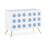
Luminous blue acrylic cabochons set in brass, on a white lacquer base, give Adler’s Globo cabinet a futuristic vibe. And Adler calls his Torino bar “chic, graphique, and an instant classique.” Modernist Milan comes to mind with the piece’s glass panes back-painted in moody hues, then arranged in a fractal design.
—-
Kim Cook writes frequently for The AP about design, décor and lifestyles topics. She can be found on Instagram at @kimcookhome and reached at kim@kimcookhome.com.
