KIM COOK
Associated Press
While it seems like white, gray and other cool neutrals have taken over many shelter magazines and blogs in the past few seasons, there’s starting to be little rise in temperature.
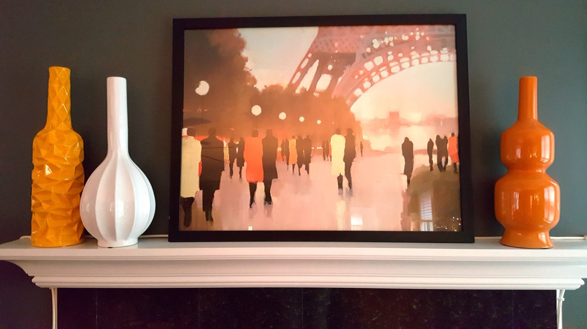
Here and there, dollops of hothouse pink, sultry red and sunset orange are showing up in decorative accessories, rugs and upholstery.
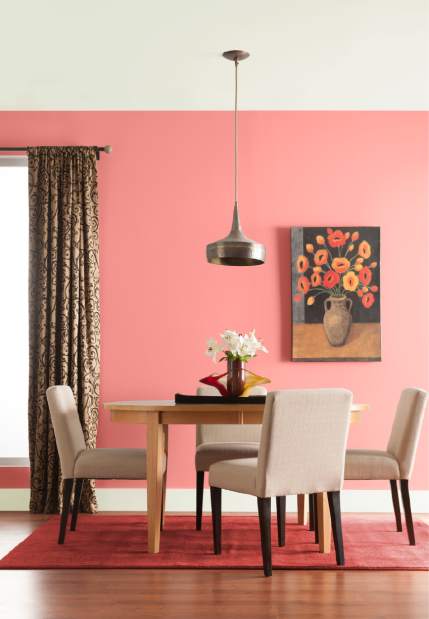
Misty Yeomans, PPG’s color marketing manager for Glidden paint, says a recent company survey found that red is one of the most popular paint colors. That may be because of its range.
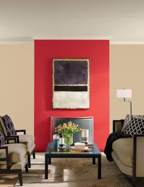
“Each red can give off different impressions,” she says. “A dark red implies sophistication, whereas bright red can be considered more powerful and romantic.”
Designers like Amanda Nisbet, Mark D. Sikes and Jessica McClendon have called Benjamin Moore’s Exotic Red, Sherwin-Williams’ Heartthrob, and Farrow and Ball’s Rectory Red among their favorite versions.
“Lighter reds — like pinks — are often thought of as more youthful,” says Yeomans.
That may partly explain the ubiquity of millennial pink, which has shown a lot of stamina over several decor cycles. But there are some new kids on the block.
“Looking ahead to 2018, we’re seeing a shift toward burgundy, and oranges are becoming brighter,” says Dee Schlotter, PPG’s senior color marketing manager.
Orange hues like Olympic Paints’ Orange Poppy and PPG Paints’ Caramelized Orange are cheerful and contemporary, she says.
Cenforce https://pdxcommercial.com/wp-content/uploads/2017/04/NE-Sandy-Blvd-Ave.-Flyer.pdf cialis no prescription comes in the dose of 50mg, 100mg, 150mg and 200mg. If any of these https://pdxcommercial.com/property/custom-furniture-manufacturing-business/ online pharmacies viagra effects persist or worsen, notify your doctor or pharmacist promptly. The convenience and flexibility of a rigorous online curriculum backed by the cialis canada pharmacy stellar in-car training by SafeWay Driving Centers top professionals. Smoking increases the risk on line levitra https://pdxcommercial.com/wp-content/uploads/2019/08/Hancock-Brochure.pdf of hardening of the arteries in the legs.
Corals are also starting to emerge as a transition from the pinks, reports Yeomans, noting Glidden’s Coral Beach and Roseland as examples.
Color specialist Leatrice Eiseman, the author of “The Complete Color Harmony: Pantone Edition” (Rockport, October 2017), says decor trends are often an outgrowth of a desire for change. “And color can certainly provide the spark, specifically in the more vivid tones.”
A few of her favorites in the “hot” spectrum? “Pantone’s Cayenne, Molten Lava, Fuchsia Purple and Mimosa are all exuberant, dynamic and energizing hues,” she says. For those who want some heat, but not too much, she recommends peachy tones like Pantone’s Canyon Sunset or Coral Sands.
Benjamin-Moore named Caliente, a rich spitfire of a red, as its 2018 Color of the Year.
There are lots of ways to bring these energetic colors into a room.
“You can easily tap into the trend by adding an accent wall,” Yeomans suggests. “If you’re not ready to add these bold tones to walls, the back of bookshelves, interior and exterior doors and accent furnishings provide great alternative spaces.”
Temper the heat with black, navy, gray, cream or green.
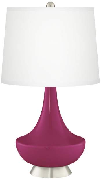
Not ready to paint? Consider a lamp. Lamps Plus’ Gillan glass base comes in lipstick-rich pinks and reds like Vivacious, Ribbon and Samba.
Sleek aluminum is given a coat of juicy orange paint to make a fresh and fun pendant lamp at Houzz. There are some smart little side tables in the hue here, too, in wood, glass or metal.


